When Should You Seasonal Color Palettes In Your Design?
It’s difficult to overstate the impact that color has on marketing. It’s not just about appearances; various color schemes and tones can genuinely elicit particular emotions and have distinct connotations. Because of this, colors are essential to a brand’s identity and have a significant impact on how customers perceive and interact with brands and products. Because of this, it’s critical that brands carefully consider the colors they use for marketing. You can find the ideal hues and tones for your brand based on the season with the help of our guide to seasonal color palettes.
Table of Contents
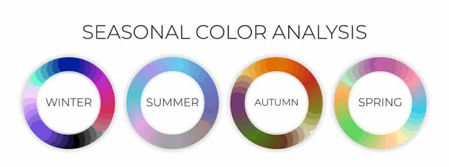
The four seasonal color palettes
Spring color palette
Bright, light colors with a hint of richness are associated with spring, the season of blossoms and renewal.If your company is considering launching a new spring campaign, consider using vivid hues like yellow, bright teal, rose red, coral, and green. Because you can always use your original branded colors and tone them down into pastels to keep them on brand while still feeling fresh, spring is an easy season to stay in line with your brand.
Summer color palette
The main goal of the summer color scheme is to contrast with the intense heat. Grays, dusty pinks, watery blues, and greens are examples of cool, muted colors that evoke tranquility and are frequently energizing. Lighten up your color scheme and think about using it for a 4th of July campaign, or simply for the start of summer. Everyone eagerly awaits the arrival of summer, and a summer campaign can assist in preparing customers for what is arguably the greatest season of the year.
Autumn color palette
An aura of coziness is created by warm, earthy tones, which are characteristic of the autumn color palette. In autumn, all you need to do is glance out your window to capture the hues of the season: rich browns and greens with natural oranges, reds, and golden yellows. Using a slightly somber color scheme for fall can encourage customers to shop by arousing feelings of nostalgia.
Winter color palette
Strong, chilly colors, such as intensely saturated reds, blues, greens, purples, and yellows, are the focal point of the winter color palette. Customers are eager to do some holiday shopping, so winter is probably the easiest (and best) time to change up your color scheme. There are many reasons to celebrate, including Boxing Day, Hanukkah, Kwanza, Christmas, Ōmisoka, and the cold weather itself. There are also a ton of color options.
Why should you use seasonal color palettes?
There is psychological evidence to support the notion that colors can affect our mood and perception. People used colorful rooms as a kind of therapy in ancient Egypt. In the 20th century, color psychology was formally investigated by scientists who used heart rate and brain activity monitoring to learn about people’s reactions to various hues. Seasonal color theory incorporates the four seasons and expands upon the principles of color psychology. Seasonal color theory suggests that using different color palettes for different seasons and holidays can elicit different emotions in branding. In the end, holiday color schemes can serve as a helpful reminder to your customers that the holidays are approaching and inspire them to start thinking about family gift-giving. Brands can use seasonal themes to update their marketing beyond the Christmas season. Employ seasonal color schemes all year long to maintain consumer interest in your advertising campaigns.
Make your designs more interesting with the help of Crystal Prints, the renowned printing agency in Essex.